Thursday, 21 June 2012

Final Project Evaluation


Project Evaluation:
Contemporary Landscapes and the Urban Environment

Knowing that the final project of the year was going to be the most important, I was always sure that 'Contemporary Landscapes and the Urban Environment' was going to be the theme. Feedback from tutors and successful work in earlier projects proved that this was the most appropriate of choices.


I would say my main strength was developing and producing work from the artist research I collected. I recreated the artist's work to familiarise myself with their techniques before working from my own photographs and observation. In some areas of the project, mainly with my final painting, I found that qualities from different artists have been combined to create a mixed-media piece that is highly successful.

 
Not everything went to plan and there were some challenges along the way. The main reason for this, I would say, is time management. I could have maybe planned my time a little better to ensure all work was completed in a certain time limit but with some of my work, it took longer to complete than I thought it would.


Overall, I’m pleased with how this project progressed. Although there could have been more, I am proud of the work I have produced and I think I’ve done well at meeting my original aims. At the exhibition, I received positive feedback from both tutors and fellow students which made me realise the choices I made throughout the project resulted in a successful sketchbook of work and a visually interesting exhibition.

Evaluation Notes


 Project Evaluation: (100 Words?)

These notes for the Project Evaluation are just a few simple bullet points to use as a reminder for what to include in the my final draft which will be submitted.

- Why based on chosen theme? Based on Feedback? Successful work? Interests?

- What went well? Be specific. What was successful? Materials, Techniques, Specific Pieces.

- What would I change? Things that didn't go as planned, Challenges I faced, Time management.

- How Artists influenced my work? Same materials, Similar techniques, Colour schemes.

- How the Exhibition turned out? Build-up, Was it how I planned?, Challenges, Final Thoughts

Finishing Touches


With the project deadline looming (22/06/2012), I have spent some time today finishing off a few bits and pieces in my sketchbook. I want my sketchbook to look the best it possibly can so I have spent a lot of time ensuring the presentation is of a high standard. I've included annotation where I think it's necessary to co-incide with posts on this blog and the reflective comments made in my journal. I'm pleased with the overall look of my sketchbook and I just hope that the tutors and moderators appreciate the time and effort I have put into this project to get it to the standard it's at now.

Exhibition Opening


Last night's exhibition was highly successful. Everyone's work was completed to the highest of standards and the exhibition as a whole looked amazing. The whole exhibition space and the huge variety of work on displayed made the night enjoyable and visually stunning. It was a great opportunity for students to explain the reasons behind their work to others and reflect upon the project's strengths and weaknesses and help with the input for the project evaluation. 

Exhibition: The Final Look


I am pleased with the how my exhibit looks. In comparison with other student's work, It's size is on the smaller side but I'm still happy with it's overall look. Personally, with the intricate, detailed pieces I create, I prefer to work on a smaller scale because I think they're more successful. I always come across numerous problems when working on a larger scale (loss of perspective etc.) and I don't think work like that is as successful.

I'm certain I have made the right choice in which pieces to exhibit. I think as well as being the best pieces from the past year and this recent project, they work really well collectively. In my opinion, the strong contrast between the two makes my exhibit more interesting. Looking back, I'm glad I decided to leave the prints in their original condition beacause if I had worked back into them with watercolour, I don't think the exhibit as a whole would be as successful. The fact that the painting is colour-based and the prints are a simplistic black and white, has made my exhibit more visually appealing. 

Displaying Work


For my painting, a rather simple method was used to display it on the screens. Using a spirit level, I ensured the painting would be straight horizontally, therefore it would be vertically accurate too. Two nail tacks were hammered into the screen on the horizontal line so that the wooden frame could be simply hung on them to keep it straight and solid. I think this was perhaps the best method to use because there are no visible marks or features (screws, brass plates etc) distracting from the piece and because of it's size, I think that's best.


The prints, as seen in the photo above, have been placed alongside each other in order of tonal qualities. To enhance these, they were mounted onto a layer of foam board shortly after they dried when they were originally created. To ensure the prints were applied with strength to the screens, several 'sticky pads' were used which not only helped with displaying them but also with enhancing them because the thickness helped bring them forward a little giving them more of an impact along with the painting.


Saturday, 16 June 2012

Painting: The Final Outcome


After being left overnight for the glue to dry, some final adjustments were made to ensure the painting was looking the best it possibly could. The frame was then painted white to co-inside with the screens. When deciding upon how and where my work would be displayed on the screen, I noticed the original wooden board was chipped on the left, and it was quite noticeable from both, a distance and close-up. To solve this problem, I asked Bill, the technician, to sand off a small margin of the wood to make the sides even. The results were successful and I was happy with how the improvements were made. All that was needed to do then, was to re-paint the frame and to ensure the adjustments weren't noticeable.

Friday, 15 June 2012

Painting Enhancement


Upon seeing the work I plan to exhibit, tutors suggested because of the size, it would be ideal for an enhancement to be made to the original painting to put more focus and attention into it to highlight it's minimalistic presence. I completely agreed after listening to their suggestion because when observing other student's work, I noticed how the difference in scale was overpowering in a way. Richard came to me and pitched the idea of a 'box-frame' to help bring out the painting a little more because the original board was rather thin. The four 2x1 wooden blocks were joined together to create the frame and that frame was then covered on one side in PVA glue and joined together with my painting before being left overnight to dry.

Thursday, 14 June 2012

Exhibition Space


The tutors have thought long and hard about allocating which exhibition space to which student. Arrangement and positioning is important if the overall show is to look impressive, and the tutors have done their best to please students as well as thinking of the look of the exhibition as a whole.
I am happy with the space provided. The white boards are perfect for displaying work and as my pieces are on the smaller side, I'm not in need of much space to display them.

Exhibition Plans


These are the pieces I plan to put into the exhibition. Both of which are developed from this current project. They are certainly the most successful pieces created over the last year and I think they will look good together as well as being suitably displayed alongside other students work, to make the exhibition as a whole look incredible.

Tuesday, 12 June 2012

Final Mixed-Media Painting


Here is the final mixed-media piece developed from some of my most successful sketchbook work. I am really pleased with the end result. The painting progressed well, and along the way, developed into a piece that wasn't exactly based on my first intention. However, saying that, I think the painting has been successful. When adding detail to the painting with biro, the piece soon became of a high-detailed quality which made me notice similarities with George Shaw's work. So I decided to progress with that look and produce a mixed-media piece influenced by different artists and combining their materials and techniques to produce something that's visually interesting.

Painting Progression: Part Three

Further layers of paint added.

Detail applied with biro.

Final Outcome.

The painting has progressed well. A lot of time spent on this one piece has created positive results. These photos show the further steps from acrylic paint to biro detail which has resulted in the painting being inspired by two of the artists that I have gathered research on for this project. The intentional expressionist 'Mitzie Green-style look' that I hoped for soon developed realistic qualities inspired by highly-detailed, contemporary artist, George Shaw.

Monday, 11 June 2012

Painting Progression: Part Two

First wash of acrylic added to painting.

Backdrop of painting.

A quick light wash of acrylic paint was applied to the collage to help define the basic shapes from my photograph. It also helped in roughly pointing out where the lighter and darker areas are and it helped that the whole piece was covered in colour because when worked back into, the original basic colours will hopefully still be visible, along with the texture and look of the collage.

Thursday, 7 June 2012

Painting Progression: Part One

Original condition of A3 wooden board.

Collage applied to the board.

First layer of paint applied to the collage.

These photos basically show the first simple stages of my painting, from the board in it's origial condition to the first amount of paint applied to the wood. The newspaper was intended to have various-sized text and font within it so that when the painting is finished, when the text is slightly visible throught the paint, it will create a more interesting look.

Painting on Board


I recently began working on my painting on board and from observation, I think it has the potential to be a visually strong piece. It may not be a of a large-scale but the combination of materials work well and the content from the photograph will hopefully be appealing to the viewer. I personally think I made the right decision with using board for this particular piece as I've learnt the materials do work well together and can create something that's both visually and physically interesting.

Photogrpahs of the development process will be recorded both here and my journal to show how the painting progresses in each of it's stages.

Photograph for Painting


This is my chosen image for the painting I am in the process of producing. I wanted to focus on a single building rather than a landscape so that the painting wouldn't look too cluttered and messy. There's quite an interesting light quality to this photograph - a sort of divide in light horizontally towards the bottom half of the photo, emphasizing the presence of the road in comparison to the sky. I wouldn't say this image is majorly interesting but I think in paint form, it could have more of a visual impact.

Wednesday, 6 June 2012

Painting Preparation: Part Two


All previous work and development for this planned piece has been displayed in my sketchbook together. Alongside images of the original artists' work and some of my own creations, there are some small, quick paintings, experimenting with the combined media to give an example and an idea of how the finished piece will look.

Painting Preparation: Part One


I spent a short time looking back over the work I created based on Mitzie Green in preparation for my seperate piece. I wanted to be sure of what materials and techniques I'd be using before starting to work on it. With the small wooden 'tile' having an interesting and effective texture and appearance, my plan is to produce a painting on board rather than paper - a result I hope will be more visually effective.

Tuesday, 5 June 2012

Final Print Plans


After constantly changing my mind, I've decided to leave my final prints as they are. I'm not 100% sure if that's the best decision but I have my reasons. If they are to be exhibited, I think they will have more of a visul impact with their original look and with my pieces as a collective, I think it will be more interesting if not all pieces are colour-based. I just hope that tutors and observers agree and are not disappointed with the final outcome.

Watercolours with Biro


This piece was also intended to be quick experimentation. I just wanted to see what materials worked well with biro. I have used acrylic previously but felt that the paint overpowered the biro and was too dominant in the piece as a whole. However, with watercolours, the light wash enables me to create an equal balance between the two materials. I didn't plan on this painting to be high in detail. I wanted the main building to be the focus point because it is of a rather intersting, hard-edged, unusual shape and I wouldn't want the landscape scenery to distract from the building.

Biro Drawings


I didn't spend too long on this biro drawing and I never planned to. The final result is unfinished because my aim was just to have an example in my sketchbook of how a biro drawing looks and how the technique used (amount of pressure applied to pen) can create an interesting effect. If I had more time, I would go back and work into it further but I just wanted the evidence to be recorded and for there to be an example of what I discussed in the previous post (Using Biro) in my sketchbook.

Saturday, 2 June 2012

Using Biro

Quick Sketch in my Journal

I've always been comfortable using a simple biro for a drawing. They are always at hand and are easier to carry around than what a box of paints are. I think the detailed, line quality that a biro can create is rather interesting and I've always admired the look that they create. Similar to a pencil, the amount of pressure applied to the pen, changes the tone and strength of the lines. After creating dry-point prints, I see a biro as being another form of media than can create a similar look. Also, a biro is great for working back into any piece. They can help refine detail in paintings and pencil drawings and when used with ink, can create something visually incredible.

Friday, 1 June 2012

Print Dilemma


I now have an important decision to make. I'm undecided in which way to go with my final prints. When experimenting with watercolour in prints, I learnt that a print can be equally interesting with or without added media. I think the simple print in the top photograph is just as effective as the watercolour-based print. Another option is to keep one final print simple, have one watercolour and maybe an acrylic combination. Although I'm not sure if acrylics will work as well as the watercolours have. I'm gonna think it through over the next few days and maybe do some more experimentation to make the choice easier.

Print Development


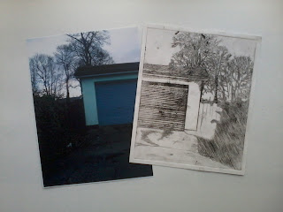
These photos practically speak for themselves. They basically demonstrate and record the devolopement of my final prints. The origin of the print was based on one of my photographs. The design was then etched into a perspex plate and once applied with a thin layer of ink, the plate passed through the press to create the final result.


As stated in earlier posts, this 'garage' plate was my favourite and most successful of the three, so It was common sence to develop this further. Previous watercolour and print combinations haven't turned out great but I think the one above is exactly what I hoped to achieve: a clear, clean, soft watercolour wash on a detailed, hard-edged print. Unlike earlier attempts, I believe the even balance of watercolour and print in this design has been achieved well.